 Skip to content
Colors shape our surroundings and our emotions, moods, and perceptions in ways that go beyond simple aesthetics. Colors have a significant impact on every aspect of our life, from the clothes we wear to the vehicles we drive to the homes we live in. The color scheme we select for our living areas can build or break the atmosphere, and as a result, how we perceive our surroundings. Let’s explore the subtleties that make each palette distinct and the effects they produce as we delve into the intriguing realm of color choices for interior spaces.
1. Purple and Gunmetal Grey: Regal Elegance
The combination of dignified purple and chic gunmetal grey produces an interior canvas that oozes class and elegance. The aggressiveness of purple and the neutrality of grey work in perfect harmony to give your living areas a feeling of opulence. This combination offers an aura of sophistication that grabs attention and makes a lasting impression, whether it is used as accents or as dominating parts.
2. Pastel Elegance: Soft Serenity
Pastels have a calming and endearing air, such as delicate pink, calming mauve, and placid baby blue. These delicate hues harmoniously meld together to provide your atmosphere with serenity. The softness of pastels makes them ideal for establishing calming environments, making them especially suitable for areas like bedrooms and relaxation areas.
3. Soft Pink and Turquoise: Playful Vibrancy
When soft pink and turquoise are combined, a vibrant color palette that gives your home a fun vitality is created. The combination of two seemingly at odds colors strikes a balance between a buoyant energy and a soft undertone. For areas that need a little personality and excitement, like kid’s rooms or art studios, this combination is a great option.
4. Aquarium Blue and Grape: Joyful Vivacity
Imagine bringing the vivacity of an aquarium into your home spaces. Grape and aquarium blue create a happy, exuberant environment. This dynamic pair is perfect for areas that need a happy lift because it emits positivity and enthusiasm. This combination has the ability to turn plain corners into eye-catching focal points, whether it is employed in public spaces or as accent walls.
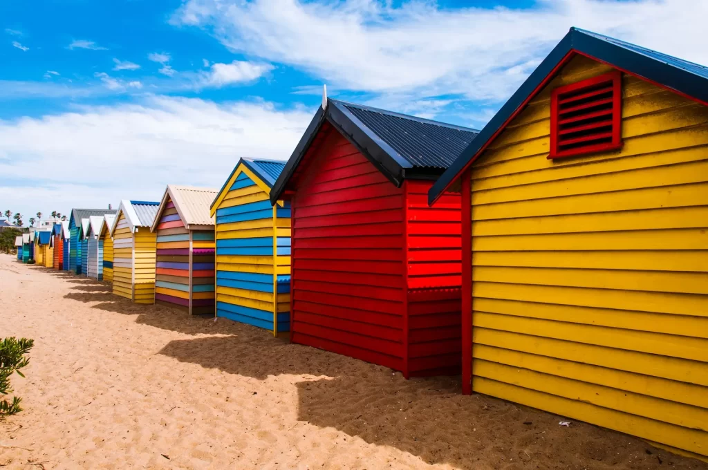
5. Blue and Yellow: Electric Dynamism
Warm yellow and vivid blue combine to make a dynamic color scheme that inspires dynamism and excitement. Yellow’s dynamism energizes the calming depth of blue, creating a mood that is both energizing and calming. Given that the yellow color is thought to improve memory and creativity, this combination is particularly well-suited for areas that call for concentration, such as study rooms or creative studios.
6. Orange with White: Celebration of Joy
Orange, the color of celebration and vigor, and white, the color of purity, create an atmosphere of joy in your living areas. This combination creates a positive and lively atmosphere. The predominant color is orange, with a calming background of white. Together, they produce a pleasant atmosphere that makes it a great option for gathering places like living rooms and dining rooms.
7. Navy Blue and White: Minimalist Sophistication
Navy blue and spotless white are the picture of understated elegance. Your rooms get depth and visual intrigue with the contrast of a deep blue and a pure white color scheme. This classic set oozes elegance and refinement, making it the perfect option for settings like dining rooms and bedrooms that call for a hint of vintage charm.
8. Elegance in Grey: Monochromatic Depth
While combining them with care, colors of grey may be anything but monotonous. The different shades of grey provide a wide range of options for giving your interiors texture and depth. This monochrome design strategy introduces a sense of understated luxury, fostering a calming yet chic atmosphere.
9. Cream and Aqua: Coastal Tranquility
Take in the calming atmosphere of cream and aqua, a color combination that conjures up thoughts of sandy beaches and calm waters. The warm basis is created by the creamy tones, while the cool touch of aqua is reminiscent of the ocean’s waves. This combination encourages peace and tranquility, making it a great option for areas that call for a retreat-like ambiance.
10. Brown and Green: Nature’s Embrace
There is no disputing the impact of nature on our emotions. The contrast of earthy brown and vibrant green reflects the restorative and relaxing affects of being outside. This color scheme creates a feeling of earthiness by bringing the essence of nature into your living areas. This combination promotes serenity and a sense of grounding whether it is employed in living areas or private havens.
Your house is a canvas, and the colors you use to paint it are the strokes that give it personality. Every color combination contains a certain energy that shapes experiences and evokes feelings. Your choices, whether you choose for striking contrasts, understated harmonies, or monochrome elegance, reflect your personality and have an impact on how you and your guests view your space. Consider the environment and feelings you want to generate as you set out on the adventure of choosing the ideal color palette. There are countless options, and your home is only waiting for your artistic touch to turn it into a work of art.
https://sydneyshinepainting.com.au/how-to-choose-a-color-palette-for-your-home/
How Colors Affect How We Feel and Acthttps://sydneyshinepainting.com.au/the-psychology-of-color/
https://sydneyshinepainting.com.au/painting-the-wall-step-by-step-tutorial/
Top 10 equipment you’ll need to paint your house
How paint is made
best-color-combinations
